3 Reasons Publishers Need to use Interactive Data Visualization

Fact: compelling visual content attracts 94% more views than ‘traditional’ written content.1
Publishers are certainly taking note with many, from The Financial Times to The Guardian to Trinity Mirror, all investing in interactive data visualization. Here are 3 compelling reason why publishers of all stripes need to consider this content form.
1. Interactive Data Visualization Attracts Users
2016 saw the introduction of a new newsfeed algorithm by Facebook. Unfortunately, publishers were on the losing end: they saw a significant drop in social referral traffic, with organic reach down a reported 52% from the previous year.2
But when it comes to using interactive data visualization to attract users and increase viewership, publishers are on the winning end.
The Financial Times (FT) uses interactive data visualizations to attract new readers through social media. In fact, the FT’s highest-performing tweet of 2016 was a visualization showing America’s change in wealth since 1971.3
Additionally, during the United Kingdom’s vote to leave the EU (commonly termed Brexit), FT created a number of informative interactive data visualizations to help portray the voter breakdown and sentiments of the UK.
Over the course of Friday June 24, the day the referendum results were announced, a page with an interactive data visualization portraying the results was by far the most popular page on FT, garnering 60 times more user viewership than the average text based story on the same subject, published on the same day.4
2. Interactive Data Visualization Enhances Editorial
A benefit all digital publishers report is an amplification of their storytelling.
As data visualization developer Tom Pearson of the Financial Times explains, “[Interactive data visualizations] provide our readers with grounding and orientation in the story, and they give our journalists an easy way to grasp the data as they emerge to inform their written reporting.”5
Additionally, Xaquin Gonzalez, editor of Guardian Visuals, explained that the visualizations his team creates are more than just a graphic element. Rather, they help portray a narrative. “The aim is to have the consistent narrative of how it all happened, replay what happened, and give context to the key moments.”6
3. Interactive Data Visualization Helps Your Content Stand Out
Studies suggest the amount of available web content is doubling every 9 to 24 months, with the pace only predicted to accelerate.7
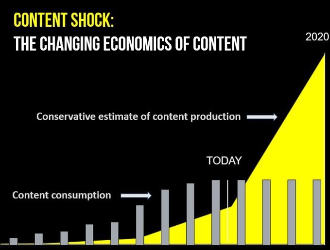
(credit: businessgrow)
Interactive data visualizations enable publishers to stand out from similar coverage and content, building value and user loyalty.
The Guardian, a UK based publication, has a 45-person development team specifically tasked with creating interactive data visuals dubbed Guardian Visuals. During the 2016 Olympic Games in Rio, the team produced new data visualizations for key events each day.8 According to Gonzalez, editor of Guardian Visuals, this gave the Guardian a competitive edge over other broadcasts.
“Anyone can write, but data visualization and visual storytelling are a way to differentiate your product, in the same way that building a strong community is important for your journalism.”9
From attracting users to enhancing editorial to standing out, interactive data visualizations offer publishers many benefits. So much so that some publishers are making big investments.
Trinity Mirror, for example, recently expanded their data visualization team to 10 members and invested in a graphic generator for their content management system – allowing every journalist on their staff to create compelling and data driven graphics.10
Indeed, it appears interactive data visualization is only set to flourish.
1. Berrocal, Angel, Hicham Alame, Joe Alderson, and David Felicissimo. Valnet Digital Publishing & Content Trends in 2017 (2016): n. pag. Valnet. 01 Dec. 2016. Web. 12 Jan. 2017.
2. Peterson, Tim. “Facebook Organic Reach Is down 52% for Publishers’ Pages This Year.” Marketing Land. N.p., 12 Aug. 2016. Web. 12 Jan. 2017.
3. Southern, Lucinda. “The Financial Times Guide to Data Visualization.” Digiday. N.p., 15 June 2016. Web. 12 Jan. 2017.
4. Pearson, Tom. “Communicating with Data — How the FT Explained Brexit.” Financial Times. N.p., 20 July 2016. Web. 12 Jan. 2017.
5. IBID
6. Southern, Lucinda. “Inside the Guardian’s Data Visualization Play for Rio.” Digiday. N.p., 09 Aug. 2016. Web. 12 Jan. 2017.
7. Shaefer, Mark. “Content Shock: Why Content Marketing Is Not a Sustainable Strategy.” Schaefer Marketing Solutions: We Help Businesses {grow}. N.p., 06 Jan. 2014. Web. 12 Jan. 2017.
8. Southern, Lucinda. “Inside the Guardian’s Data Visualization Play for Rio.” Digiday. N.p., 09 Aug. 2016. Web. 12 Jan. 2017.
9. IBID
10. Southern, Lucinda. “Inside Trinity Mirror’s Data-visualization Unit.” Digiday. N.p., 08 Dec. 2016. Web. 12 Jan. 2017.